Google Payments design system
Project Summary
I created the original Google Payments Platform design system in Figma, consisting of UI components, typography styles, and a color palette. The system is based on the Google Material Design framework, ensuring consistency with Google's broader design language. The library features 300+ flexible components with variants and adaptable styles to accommodate a wide range of use cases.
ROLE
Lead designer
CLINET
Google
PROJECT TYPE
Design system
The problem
The Google Payments team lacked a dedicated component library, forcing designers to rely on Google Material components that were limited and often didn’t match what was in production for the Payments team. This led to inconsistencies in layout, sizing, padding, and colors. Without a reliable library, designers frequently created components from scratch or copied them from other design files, resulting in one-off, non-standardized components that lacked flexibility and customization.
“Our UX mocks are inconsistent. Padding and styles are all over the place...”
The process
Step 1
Inspect Production Components
I started by consulting with engineers to understand which components were in production. I reviewed engineering specs and gathered all component variables to ensure alignment between design and development.
Step 2
Audit Designers’ Mocks
Next, I analyzed existing UX mocks from other designers to identify common components, spot inconsistencies, and trace their sources. I compared these with engineering specs to uncover gaps and mismatches.
Step 3
Create the design system
With a clear understanding of the requirements, I built a new design system featuring a full set of components with variable states, typography styles, and team color pallet. I ensured complete parity between the design kit components and the engineers’ implemented components.
Step 4
Spread awareness
Once the design system was complete, I trained the team on how to use it effectively, shared best practices, and established a process for requesting new components to keep the system up to date.
Deliverables
Components Library
Variable UI components
Colors
Color origin, values and usage
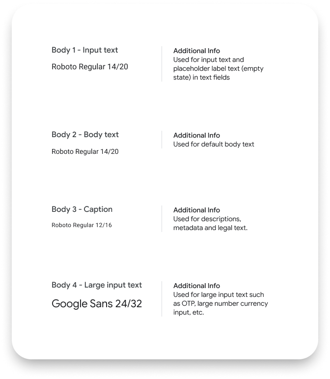
Text styles
typography details and usage
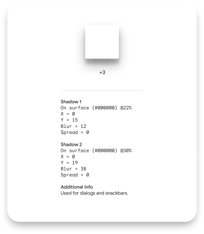
Elevation styles
Shadow and color value, usage
Iconography
System and payment method icons
Interaction symbols
Screen interactions symbols
Demo
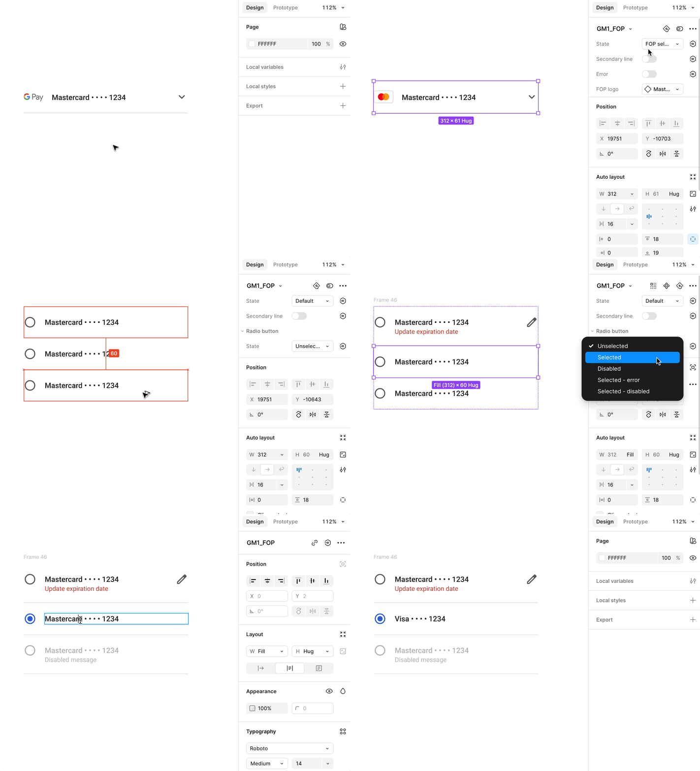
All components in the library feature a variety of multiple states, scalable sizes, and are highly customizable to meet designers’ specific needs and preferences.
Increased Efficiency
and Consistency
Designers no longer needed to recreate components, reducing design time and ensuring consistency in layout
The Impact
Improved Collaboration
and Flexibility
Standardized components and clear guidelines promote collaboration between designers and engineers, enabled quick adaptations to changing product needs
