Google checkout redesign
Project Summary
The Google checkout cart redesign project modernized and streamlined an outdated checkout experience used across 50+ Google products. I conduscted internal an external audits and applied industry best practices to develop a new multi-step checkout navigation model designed to enhance speed and usability.
PROJECT TYPE
End-to-End flows
CLINET
Google
ROLE
Lead UX designer
The problem
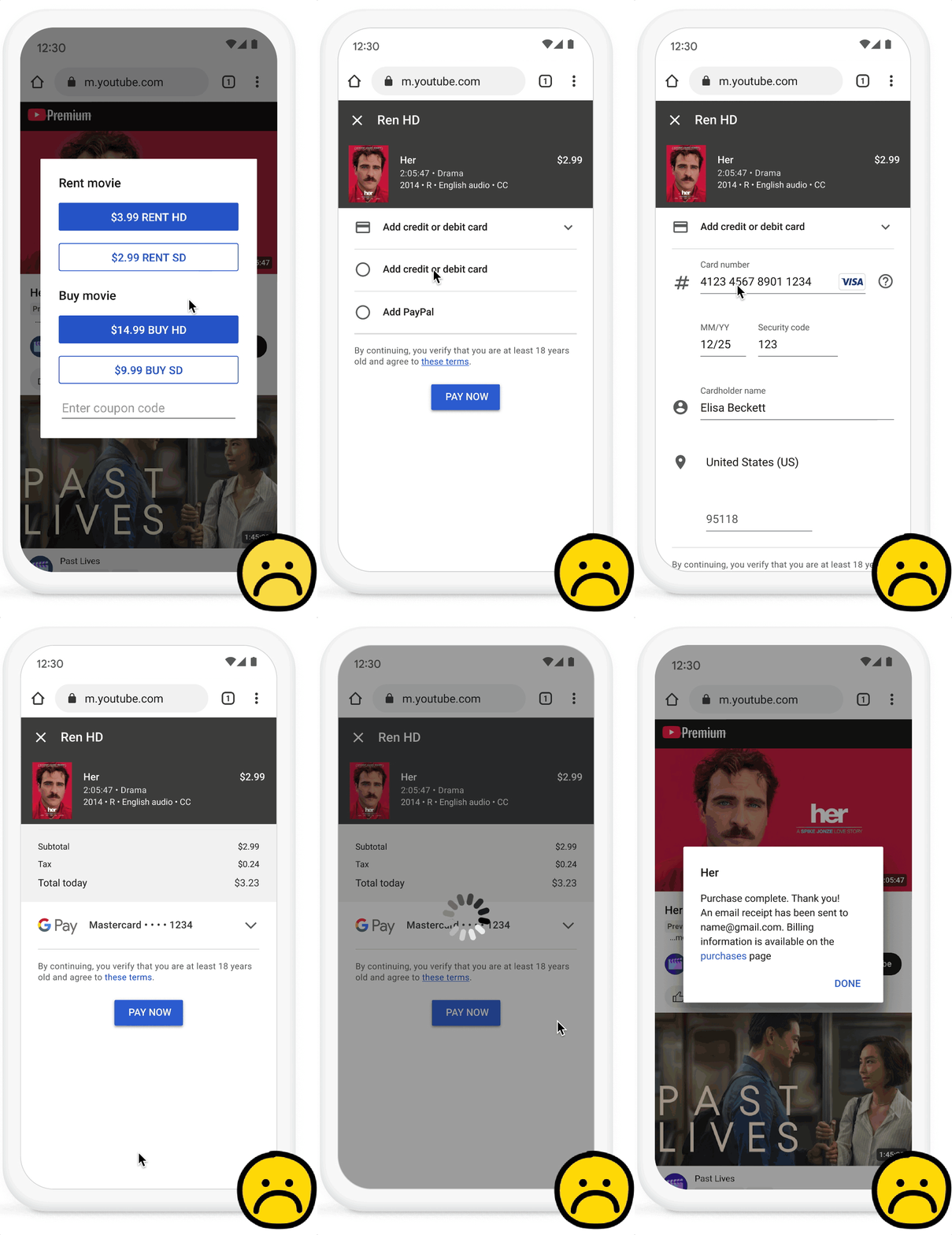
The previous Google checkout experience was outdated and failed to meet modern user expectations. Its navigation was confusing, leading to user frustration and drop-offs. Accessibility was compromised, making the experience difficult to navigate. The design also lacked visual appeal and did not align with Google Material design system standards. These issues contributed to a suboptimal conversion rate, highlighting the need for a comprehensive redesign to improve usability, accessibility, and overall performance.
“The checkout felt confusing. I had to click “Pay now” button three times before completing the purchase”
The process
Step 1
Applying Industry Best Practices
External competitive analysis was conducted to benchmark Google’s checkout experience against industry leaders. Best practices from the Baymard Research Institute for e-commerce usability were applied, ensuring an optimized checkout that meets modern user expectations.
Step 2
Redefining Navigation
The checkout flow was redesigned to eliminate confusion, ensuring a seamless and intuitive experience. By simplifying the navigation structure, users could complete purchases more efficiently, reducing frustration and drop-offs.
Step 3
Enhancing Accessibility
Accessibility improvements were implemented to make the checkout process inclusive for all users. The redesign adhered to Google accessibility standards standards, ensuring better usability for individuals with disabilities.
Step 4
Modernizing the UI
The checkout experience was updated to align with Google Material design system, enhancing visual appeal and brand consistency. A more polished and structured interface contributed to a better user experience and improved conversion rates.
SEE FINAL DESIGNS
Deliverables
Mobile view
Step 1:
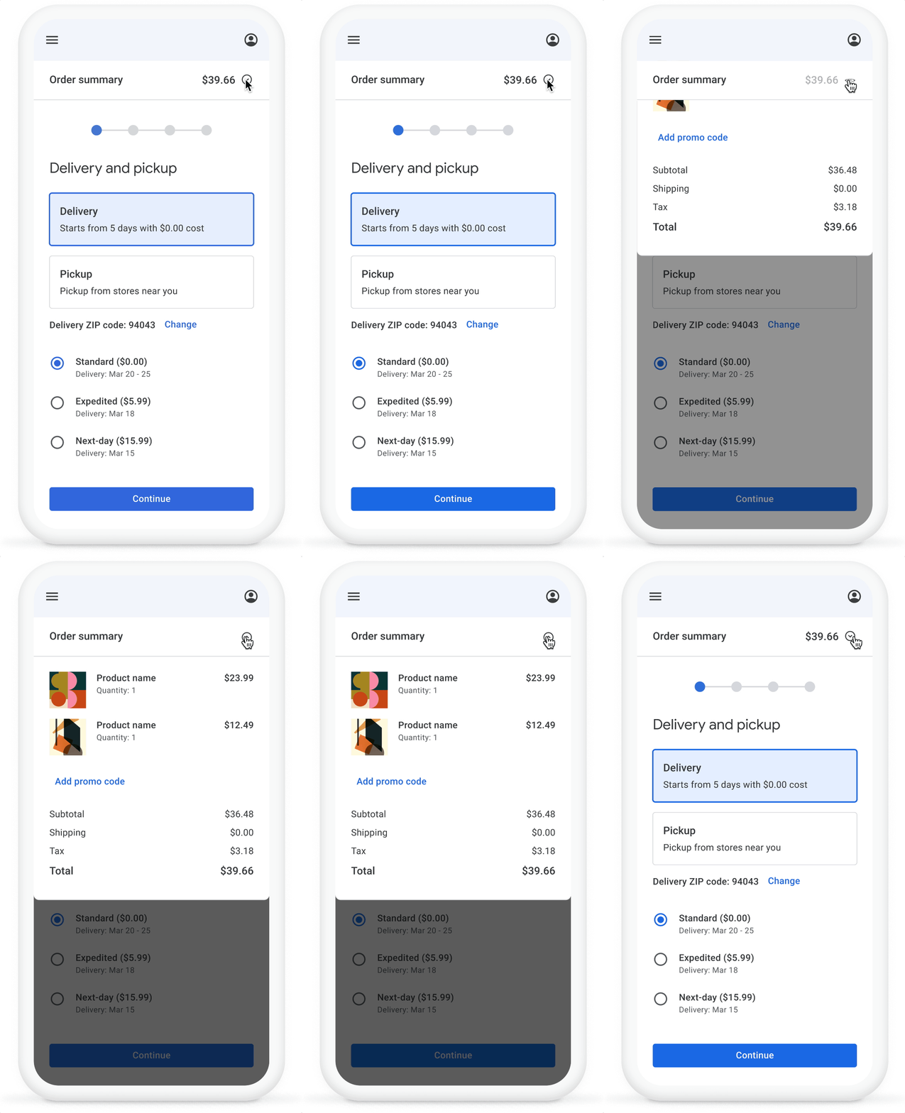
Delivery and pickup
The order summary and cost breakdown are tucked away in a slide-down drawer, accessible at any step of the purchase flow.
Step 2:
Shipping address
The breadcrumb displays the total number of steps and the user's progress, with each step's name shown in the page title.
Step 3:
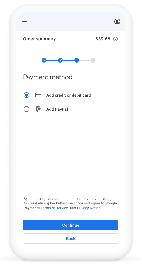
Payment method
User chooses their preferred payment method before entering payment details.
Step 4:
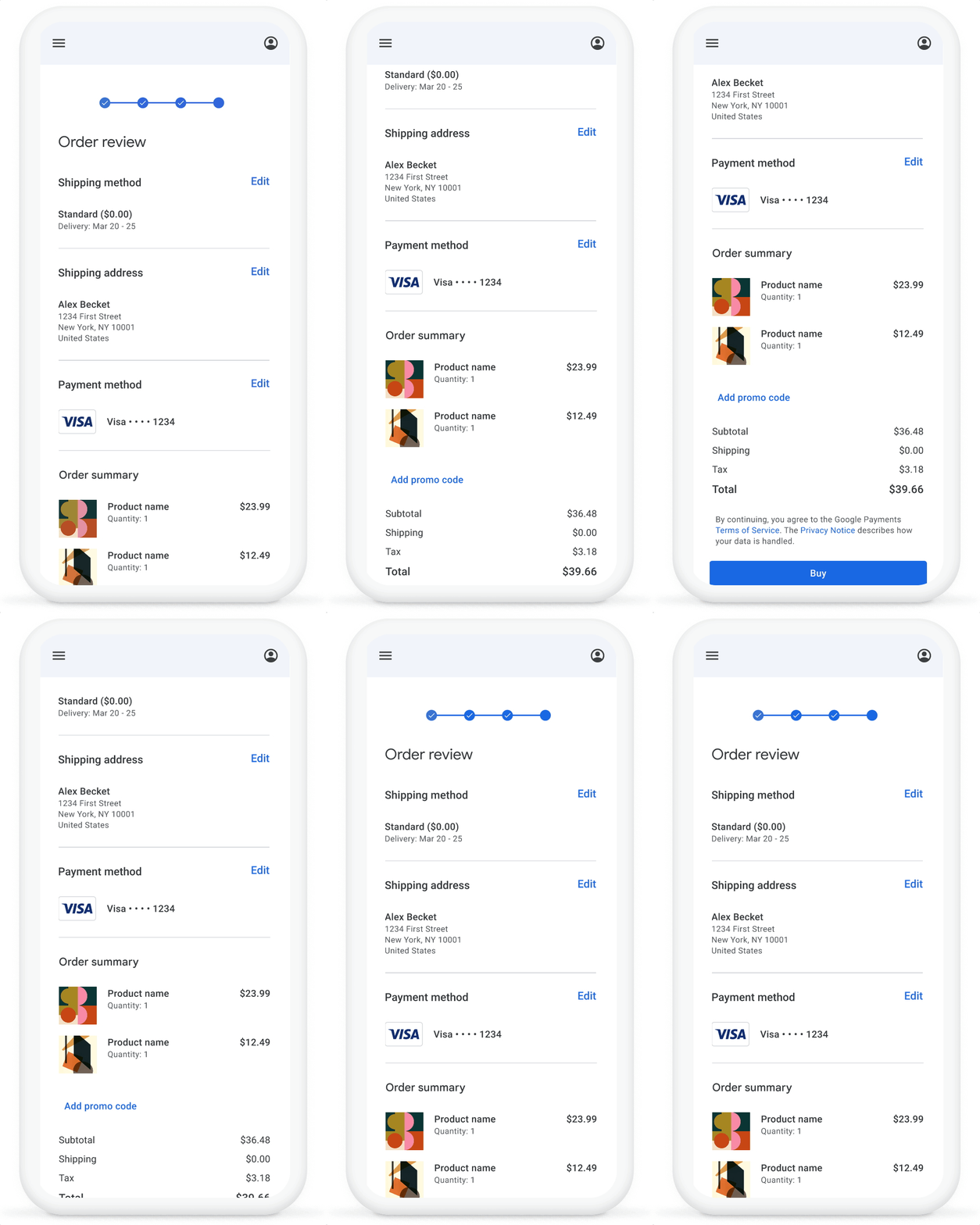
Review order
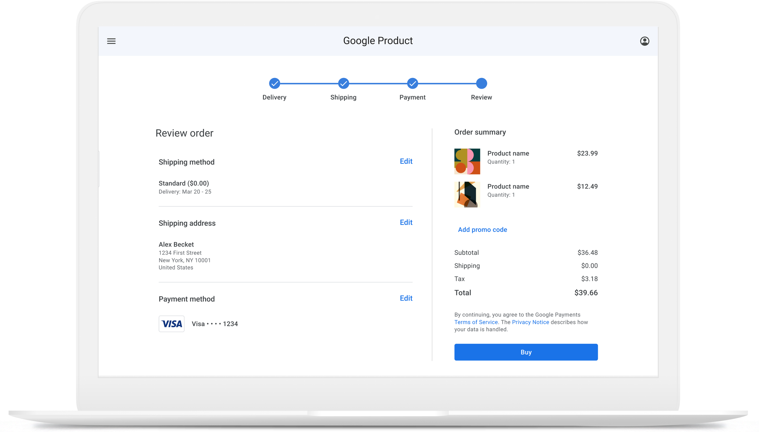
User information entered on previous steps, can be edited directly on the review step. The order summary moves from the top drawer to the bottom of the page.
Desktop view
Key differences between desktop and mobile
The desktop design features a distinct layout and interaction patterns, including a two-column structure, a breadcrumb with visible step names, and a sticky, always-visible order summary.
Reduced checkout errors caused by user mistakes
The Impact
faster checkout
completion rate


